Esurance iPhone App
a new look with new features
The problem: Esurance had a completely out of date iPhone application that needed both UX and UI improvements. The old design was five years old and, from a functionality standpoint, the application could not provide the support that many of our competitors could. A completely new information architecture and design language would need to be established that could speak to our new needed functions.
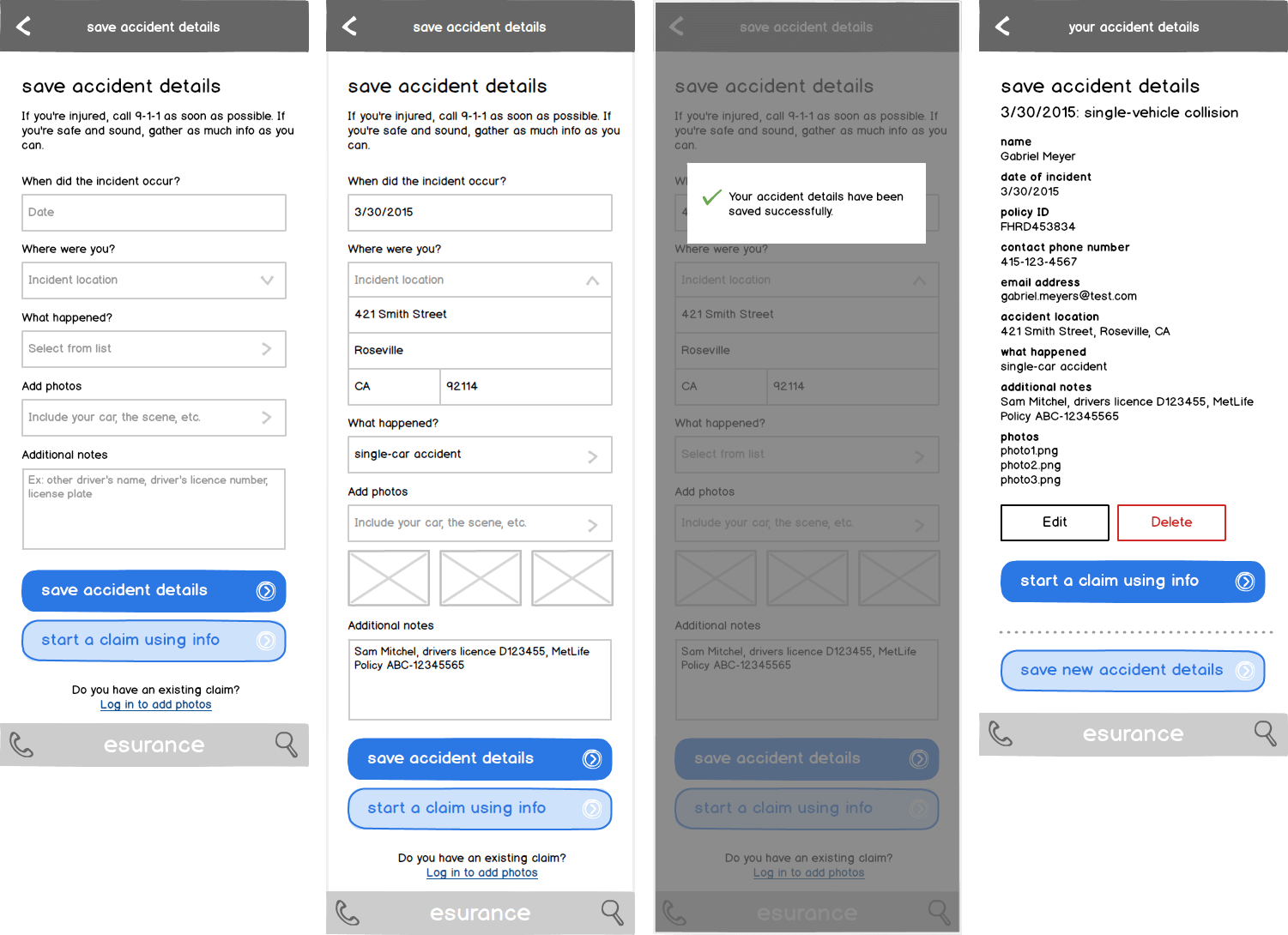
There were many new flows that needed to be implemented into our new application. Functionality we decided that would be needed was the ability to manage your auto policy, report a claim, save accident details, and also saving your insurance card to the Apple Wallet. These flows needed to be accessible from the main menu and needed to be readily available during the correct time.
Mockups and screenshots of our old out of date application can be seen below:
The Goal
The goal was to create a new application, using our own visual language that would inform the user what they should focus on, any outstanding bills or issues, how they could set up accident details, and saving their ID card. We also strived to create reusable visual hierachy that maintained our current visual brand but also would create a modern feel. Doing this all at once would take lots of brainstorming, design, user testing, and iterations.
The Process
Our process began with brainstorming all the functionality we wanted to put into the new application. Additionally, we wanted to remove outdated and poorly performing functions that the old application had. We came up functionality that must make it into the application and also some functionality that is nice to have.
Once the process flow was completed, we  concepted and wireframe design solutions that would be most usable to our current and future policy holders. This process was then put into  prototypes and tested among our current policy holders to make sure it was usable and contained the functionality they desired.
We then began the visual design process. This was lengthy because we not only had to add a color scheme but also a text, button, and form element hierarchy within the application. This was probably the longest portion of the process due to the subjectiveness of visual design. Once a visual brand and hierarchy were created, we began another round of usability research to make sure the user experience was not jeopardized through the visual design.
The Solution
The final result was an up to date and usable application that could be used by any policy holder. New functionality was easy to use and apparent from the login screen and from the main menu. The information architecture created an experience that was easy to use. Finally, we had a new visual language and mobile brand identity that could be reused many times over.
The Results
Our application gained momentum as we were a featured application within the app store. It then received significantly better reviews than our old application. Furthermore it decreased calls into our claims department, because users were able to file claims through the mobile application. Also, the application let policyholders change the details of their policy, making it simple for people to review and adjust. This reduced contact with our call centers as well. Finally, it also reduced calls into customer service for lost insurance cards.
DON’T BE SHY, I WON’T BITE!
TELL ME ABOUT YOUR NEW PROJECT 
I ALWAYS LIKE TO LISTEN OVER A coffee.
C
O
N
T
A
C
T
Ari Salomon
938 Geary St.
San Francisco, CA 94109
assalomon@gmail.com(503) 476-5379